Sorry Haters, the Nothing Phone 3 Looks Good
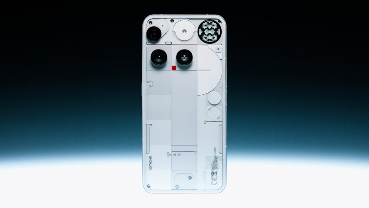
The Nothing Phone 3 has one of the most outlandish designs of any device out there, and it’s ruffled more than a few feathers. Frankly, it’s shaken the whole henhouse. Every Nothing device, from Phone 1 through Phone 3a, all featured transparent glass backs and a “Glyph Interface” full of winding LED strips that would light up with custom alerts or visual cues. That’s gone with the Phone 3, replaced with a field of square boxes called the “Glyph Matrix” that displays simple pixelated images and a trifecta of asymmetrical, misaligned camera bumps. To sum it up, fans hated it, and one word showed up in critiques over and over: “ugly.”
In an interview with Design Milk, Nothing’s lead designer, Adam Bates, extolled the Glyph Matrix with its small field of micro-LEDs as more “expressive,” but he failed to articulate just what the hell was going on with the rest of the device. We’re still planning to share our full thoughts on the Phone 3, where we’ll compare Nothing’s first $800 “flagship” mobile device to other expensive phones, but I’m not here to talk about its supposed less-than-flagship chip or the quality of the cameras compared to other heavy hitters. I’m not even here to talk about how repairable it is compared to other devices. I just want to talk about how the thing looks. Guess what? It looks good.
We sit here every day hearing from consumers just how bored they are with the same slab phone design. Every iPhone is practically indistinguishable from the latest Samsung Galaxy or Google Pixel phone—from the flat sides and rounded corners down to the camera bump. We want a design that tells a story, that examines the tech housed inside that chassis of glass and metal. So why is the internet so universally antagonistic to something that tells a story through its aesthetic?

The manufacturers of phone cameras often combine all lenses into a single array. That’s how most of the larger phone makers procure them—prefabricated. Your regular iPhone 16 Pro places each Sony-made lens in a triangular pattern, but the actual apparatus is connected to the phone’s motherboard as one unit. In a teardown of the phone shared exclusively with Gizmodo, the repair gurus at iFixit showed how each camera is an individual unit on the Nothing Phone 3. The repair team said there are four press connectors that attach to the top of the motherboard, and you can remove all three cameras without needing to take out the motherboard.
The Phone 3 has a 50-megapixel wide, a 50-megapixel periscope, and a 50-megapixel ultrawide lens. We don’t know if Nothing procured its cameras like this because it was cheaper or for some other reason related to supply chains or its mobile design. iFixit told us the cameras are arranged so it may be possible to shift the top telephoto sensor, aligning top to bottom. It’s unclear if this would cause some other issue with the device or if the parts sourced for the phone wouldn’t allow for cameras to sit in a row.
Either way, it comes across as eye-catching, an asymmetry that I would describe as evocative in a way that speaks to the niche online circles who love modding and pseudo-analog tech. It harkens to my growing appreciation for ad hoc-stylized science fiction, specifically all that gets laid under the umbrella of “cyberpunk.”


I’ve been a little too obsessed with CD Projekt Red’s Cyberpunk 2077 lately, partially because I had to play the game ported to both Switch 2 and Mac in quick succession. The game holds a beauty far beyond the number of pixels it’s pushing. It’s all down to the inherent design ethos, which you can find in its digital art book. The game’s designers took inspiration from classic high-tech, low-society genre sci-fi. Other great examples of this kind of asymmetrical tech can be seen in the many examples inspired by the anime film Ghost in the Shell, down to the Brazilian cover art of William Gibson’s seminal 1984 novel Neuromancer designed by artist Josan Gonzalez (we’ll have to see if the upcoming Apple TV show can match our collective imaginations).
In this art, we see the tech exposed, wires exploding out of devices like exposed veins connected to an LED heart—what would be nonsense and excessive by most standards of engineering. The Phone 3 isn’t that explicit, but its glass back and near-nonsensical panels are obviously drawing from this style of tech.

The developers of Cyberpunk 2077 managed to encapsulate this style in their game. They crafted four separate archetypes that can help us understand where the Phone 3 fits in. One of those that stands out is “Entropism”—the idea that crude necessity and slapdash tech can itself be a kind of “style.” This is the opposite of what the designers called “Kitsch,” which could be best boiled down to style over substance—or gaudy extremes and neon caked into every crevice, serving no purpose.
Then there’s “Neokitsch,” a combination of the former two, extolling excess while working within the confines of practicality. The Phone 3 fits neatly into that category, though its off-white plastic almost has a kind of “NASA Punk” appearance akin to Bethesda’s Starfield. Naysayers lambaste its odd misplacement of the three camera bumps. That asymmetry is not a flaw but a necessity born out of how Nothing decided to source its three cameras. Other teardowns by YouTuber JerryRigEverything show us how the makers of the Phone 3 created a wireless charging coil that’s shaped like an apple with a bite taken out of it.
This odd shape means it could support the special glyph button used to operate the new Glyph Matrix. Whether or not that button is usable or even useful is another question. Instead, we can take in the design and understand more of why it was built the way it was. There’s a beauty in that. It’s expression through design and engineering, something that’s so rarely seen in today’s world of Apple-like, all-too-clean tech.
[embed]https://www.youtube.com/watch?v=xItKw0p_s-o[/embed]
The Phone 3 design isn’t what anyone would call “lo-fi,” but in ways it reminds me of how special effects designers imagine technology. Star Wars is one of the best examples of a high-tech setting with a low-tech aesthetic—born out of director George Lucas and the first film’s prop crafters’ need to make futuristic devices with whatever was on hand. That history of design extends to today’s best Star Wars content. Andor’s first season is a perfect example of this. In episode 5, the young idealist Karis Nemik extols the benefits of tech not made by the Empire, that it can be remodeled and remade by its owner. His device is blocky, asymmetrical, and dirty. That’s because it was likely an old Polaroid camera, specifically an SX-70, with other bits and bobs stapled to its front and sides. We don’t know what all those doohickeys are for, but it drives the imagination.
Similarly, the Phone 3 wants me to wonder what each random button does, why the cameras are located where they are, or why it has a red camera light. Even if the answer isn’t as engaging as the question, I’m glad it made me wonder all the same.

Despite the appearance of modularity, there’s nothing to say the Nothing Phone 3 is any more repairable than the company’s previous devices. iFixit told Gizmodo the phone is annoying to open since it requires users to remove several adhesive components, including the back cover. If Nothing worked to make its phones the most customizable, the most repairable, and combined that with a look that emphasizes all those, it would be a winner. What if Nothing started to sell parts to its phones while maintaining its “Neokitsch” style? That would be enough to truly set the brand apart from all the others, and maybe it would be enough to calm the haters… maybe.


Категории
Больше
Nhóm ngành STEM Năm học 2025, nhóm ngành STEM (Khoa học - Công nghệ - Kỹ thuật - Toán học) ghi nhận sức bật mạnh mẽ với 222.454 thí sinh đặt nguyện vọng 1, tăng gần 42.000 so với năm 2024, theo Bộ GD&ĐT. Nếu năm ngoái STEM đã “nóng”, thì năm nay các ngành Khoa học máy tính, Công nghệ thông tin, Trí tuệ nhân tạo và Kỹ thuật - Công nghệ bán dẫn càng...

Tuổi nghỉ hưu năm 2026 được xác định căn cứ theo Bộ luật Lao động 2019. Điều 169 Bộ luật Lao động 2019 quy định tuổi nghỉ hưu: Điều 169. Tuổi nghỉ hưu 1. Người lao động bảo đảm điều kiện về thời gian đóng bảo hiểm xã hội theo quy định của pháp luật về bảo hiểm xã hội được hưởng lương hưu khi đủ tuổi nghỉ hưu. 2. Tuổi nghỉ hưu của người lao động...

A balloon-borne experiment over Antarctica, designed to detect cosmic radio waves, has instead picked up bizarre signals that appear to be coming from deep within the ice. These signals challenge our current understanding of particle physics, scientists say. The Antarctic Impulsive Transient Antenna (ANITA) experiment consists of radio antennas...

Cô gái được ví như bản sao của Ngân 98, nổi bật với vẻ đẹp gợi cảm và phong cách táo bạo, đã thu hút sự chú ý của cộng đồng mạng trong thời gian gần đây. Với những đường cong quyến rũ và thần thái tự tin, cô nàng này không chỉ gây ấn tượng bởi ngoại hình mà còn bởi cá tính mạnh mẽ và phong cách thời trang độc đáo.Nhan sắc nổi bật và phong cách thời trang táo bạoCô gái có tài khoản là Huỳnh Lai...
Illinois Governor JB Pritzker signed, on Friday, a new measure that bans AI from acting as a therapist or counselor and limits its use to strictly administrative or support roles. The Wellness and Oversight for Psychological Resources Act comes as states and federal regulators are starting to grapple with how to protect patients from the growing and...